Neutral Color and Natural Material Design Trend: How to Blend Natural Shades with Natural Stone
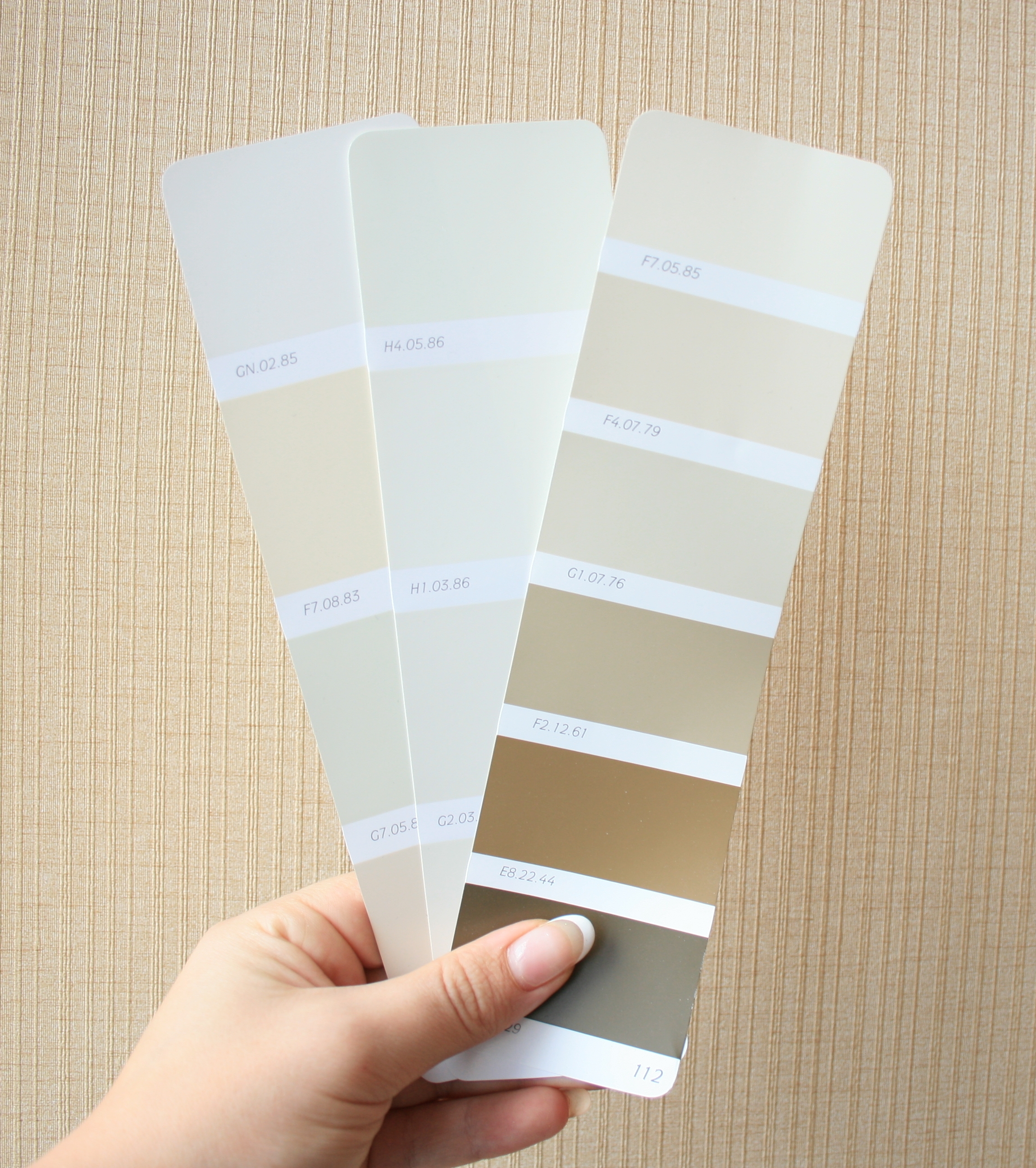
There’s no denying the fact that the color grey has influenced recent design trends. With many articles published on the subject in the field of interior design, various paint manufacturers have increased their color offerings to include a growing array of greys. Benjamin Moore, for example, has 2 color volumes entirely devoted to these colors, titled “Naturally Neutral” and “Shades of Grey”.
So what’s the appeal in all this greying-down of design?
- Enjoy Versatile Tones
- Works with Natural Materials
- Combine the Elements in a Design Board
Step 1: Enjoy Versatile Tones

One of the attractions to this collection of tones is their versatility. A staple in creating stunning designs, greys work well for any application, not just painted walls. Neutral colors for cabinets, floors and furniture add dimension to a monochromatic palette, letting the details speak of themselves, uninterrupted by saturated colors. An infinite range can be found in the colorful grey category based on factors such as the temperature (warm or cool), the shade, and the color of the undertones (blues, browns and greens) that come to the surface. “Greige” colors make a nice choice to soften and balance bold furnishings and can even exhibit a zen quality, reflecting restraint in the details of a design.
What exactly is Greige?“Greige” is a popular buzz word in certain circles which is typically defined as a grey with undertones tinting towards a beige or brown hue. This is a living and ever-changing color that is affected by various light sources, whether artificial or natural, at different times of day or night.
Step 2: Works with Natural Materials

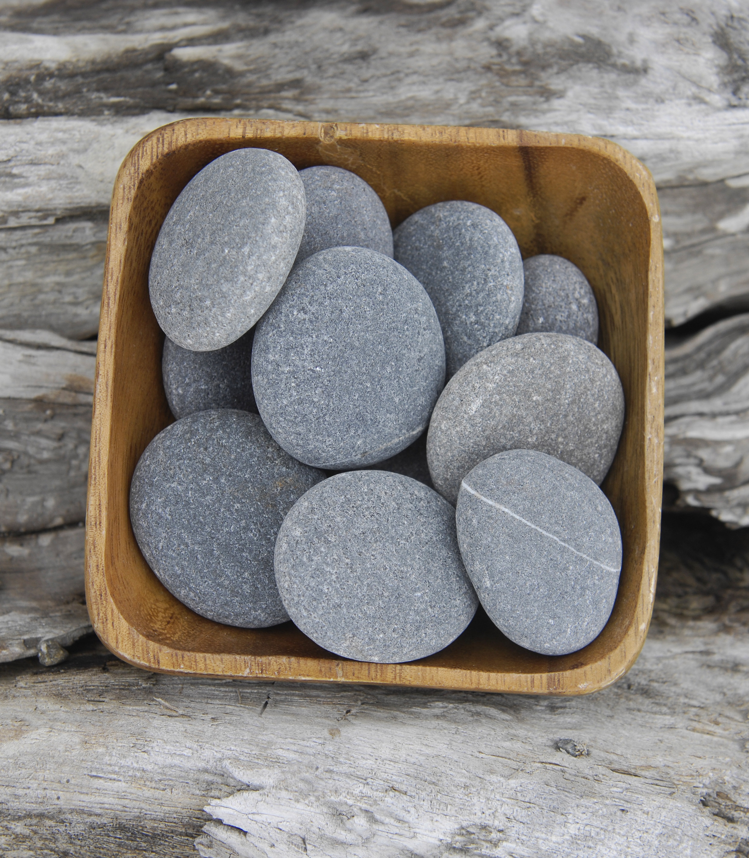
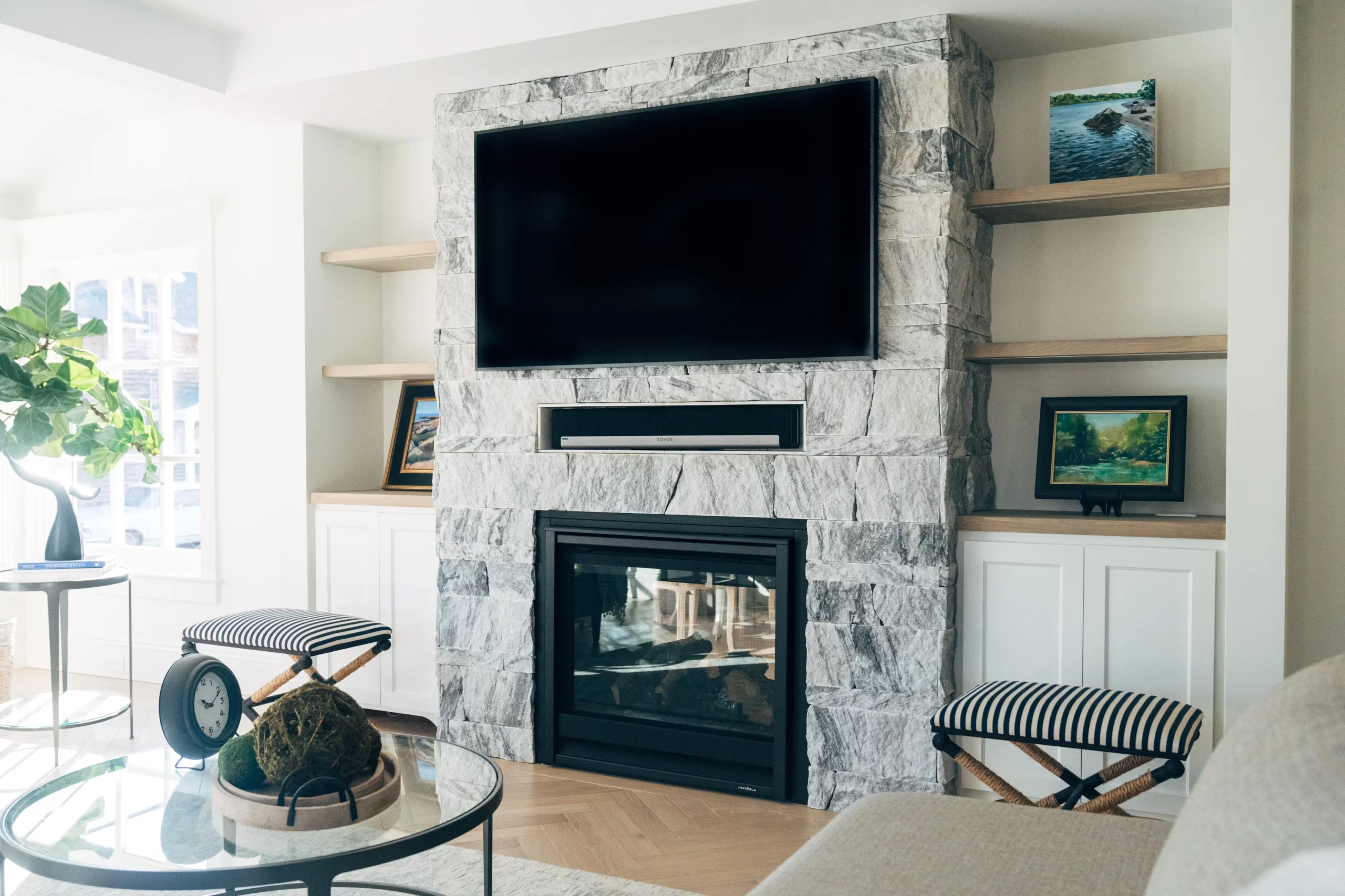
Think of the colors in a piece of reclaimed wood or a block of raw, natural stone. Designers have been selecting these softer shades and more subdued tones in the finishes of their projects. Saint Pierre Limestone, for example, is a unique warm grey limestone with brown undertones that blends well with color accents in the design. It has a shade that is not too dark or too light, and can be set against a wide array of other colors with success. It can be vein-cut to exhibit a flowing movement or cross-cut for a more random appearance, occasionally exhibiting shell inclusions from its formation, emphasizing its natural origin.
Step 3. Combine the Elements in a Design Board

Nothing helps to better visualize how to tie together these various elements in your design than a sample design board. Traditionally used as way to present conceptual ideas to clients with drawings and photos, a design board is a fantastic way to gain inspiration and set out on a creative path toward a successful finished project.


